

Tools that shape thought
Using visual form to test, clarify, and correct meaning
Written by M.C. Madrigal – Senior Brand Designer, Intercom Creative Studio
In Ted Chiang’s short story The Truth of Fact, the Truth of Feeling, a man in a pre-literate society witnesses the arrival of writing from a European missionary. Over time, he comes to understand that writing doesn’t merely record thoughts; it actively creates and shapes them. The act of writing forces ideas into order, gives them structure, and ultimately changes how people think.
I’ve always felt this way about graphic design. Design, like writing, isn’t a container for meaning; it’s a meaning-making tool. It doesn’t just present information. It helps determine what matters, how ideas relate to one another, and what story ultimately emerges. In practice, design becomes a way of interrogating content, clarifying priorities, and shaping understanding.
That belief was put to the test very directly while designing the 2026 Customer Service Transformation Report.

Design as interpretation, not decoration
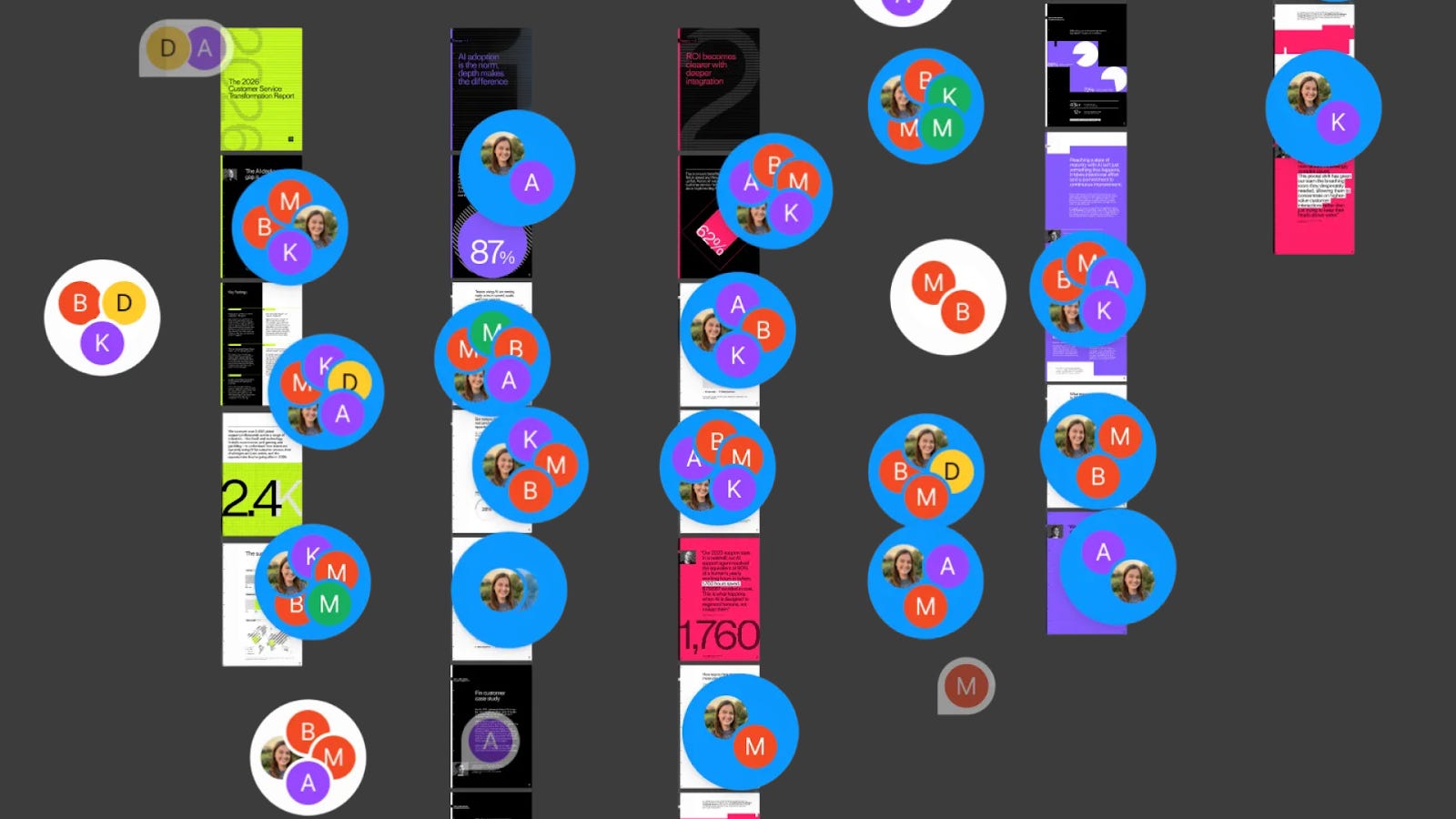
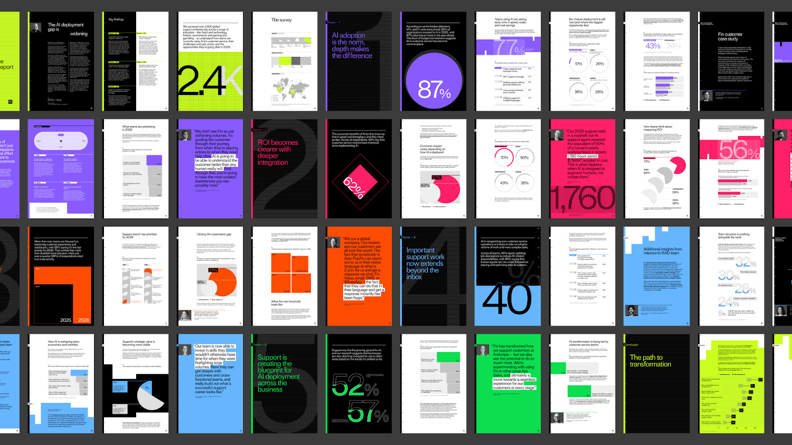
Our annual “Customer Service Transformation Report” is a multi-format research publication exploring how AI maturity compounds over time. It brings together original survey data, analysis, and long-range insight into how organizations adopt and scale AI in customer service. The complexity of the data, combined with the ambition of the narrative, made it an unusually good stress test for design as a truth-telling tool.
I led design on the report as part of Intercom Creative Studio, working closely with the content team and another senior designer, Ashlyn Lasson. From the beginning, the project was deeply collaborative. Design and content evolved together, with constant back-and-forth around how the story was being interpreted and communicated.
As we designed, we were continually asking questions. Did we understand this insight correctly? Were we emphasizing the most important signal, or amplifying noise? Was the visual hierarchy reinforcing the intended narrative, or quietly distorting it?
Design wasn’t something applied at the end. It was part of the thinking process itself.
When visuals reveal misunderstanding
At several points, designing the report felt like a lesson. Not just a process of clarifying meaning, but one that actively exposed gaps in our own understanding.
One early example was a graph concept I proposed to visualize adoption over time. I gravitated toward a wave-like form, hoping to capture momentum and scale.
Visually, it felt intuitive. Conceptually, it was wrong.
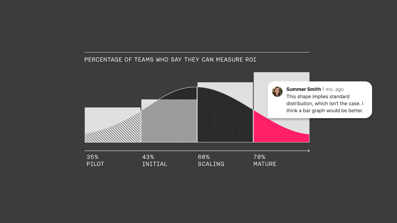
Once I looked closely at what the data was actually saying, it became clear that the wave metaphor implied dynamics that weren’t truly there. The visual was telling a story the content didn’t support. That mismatch forced me to step back, reread the data, and rethink how the information should be represented.
Designing surfaced a misunderstanding.
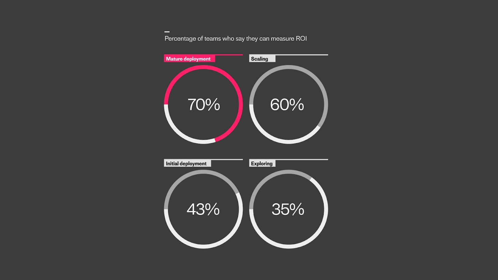
We pivoted accordingly, switching to a simpler circular treatment that made comparisons across maturity stages legible without introducing implied movement or momentum that the data didn’t justify.
Does the system match the story?
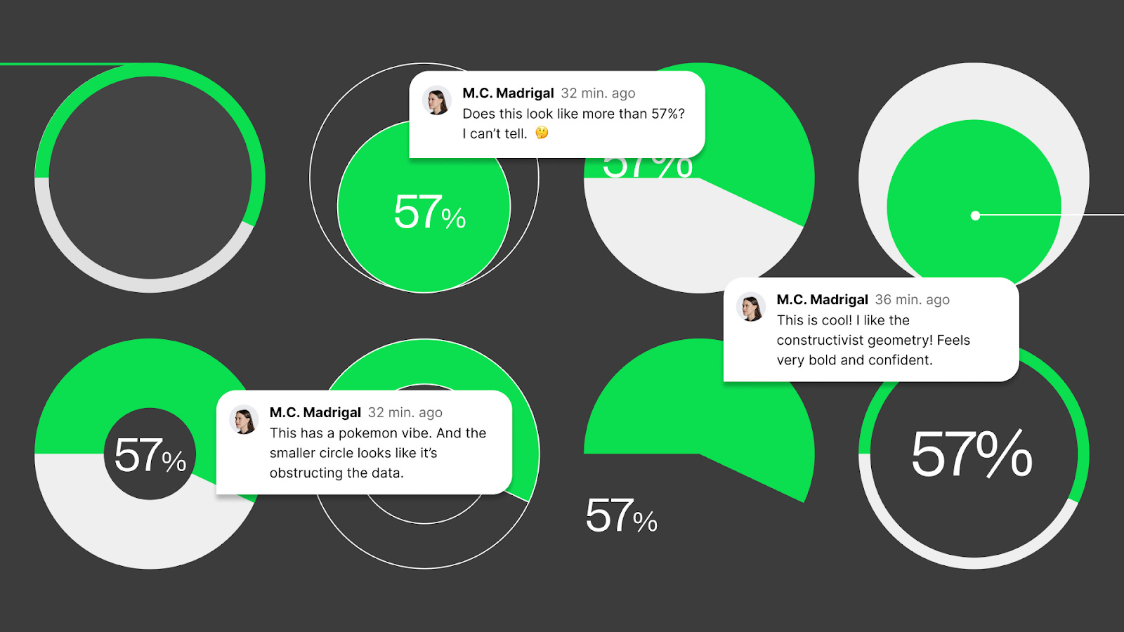
Some of the toughest design decisions weren’t about finding a way to show the data, but about choosing which visual language best reflected what the data actually supported.
For one key metric, we explored a wide range of circular chart styles. Each option could technically show the same number, but each implied something different. Some overstated progress. Others softened it. A few introduced visual confidence the data didn’t earn.
We ultimately gravitated toward two approaches: a bold filled wedge and a thin open ring. Both allowed the value to be read clearly and in full, without distortion. None of the other versions were “wrong” on their own, but many subtly shifted perception through scale, proportion, or emphasis.
At its core, the report explores how the gap between early and late AI adopters continues to widen. Organizations that adopt early see compounding benefits, while those that lag behind struggle to catch up. That idea of divergence, of distance growing over time, became the foundation for the visual system.
We introduced ruler lines as a recurring motif, drawing on their associations with measurement, progress, scale, and time. As readers move through the report, elements shift, separate, and realign, reinforcing the idea that maturity changes not just outcomes, but structure itself.
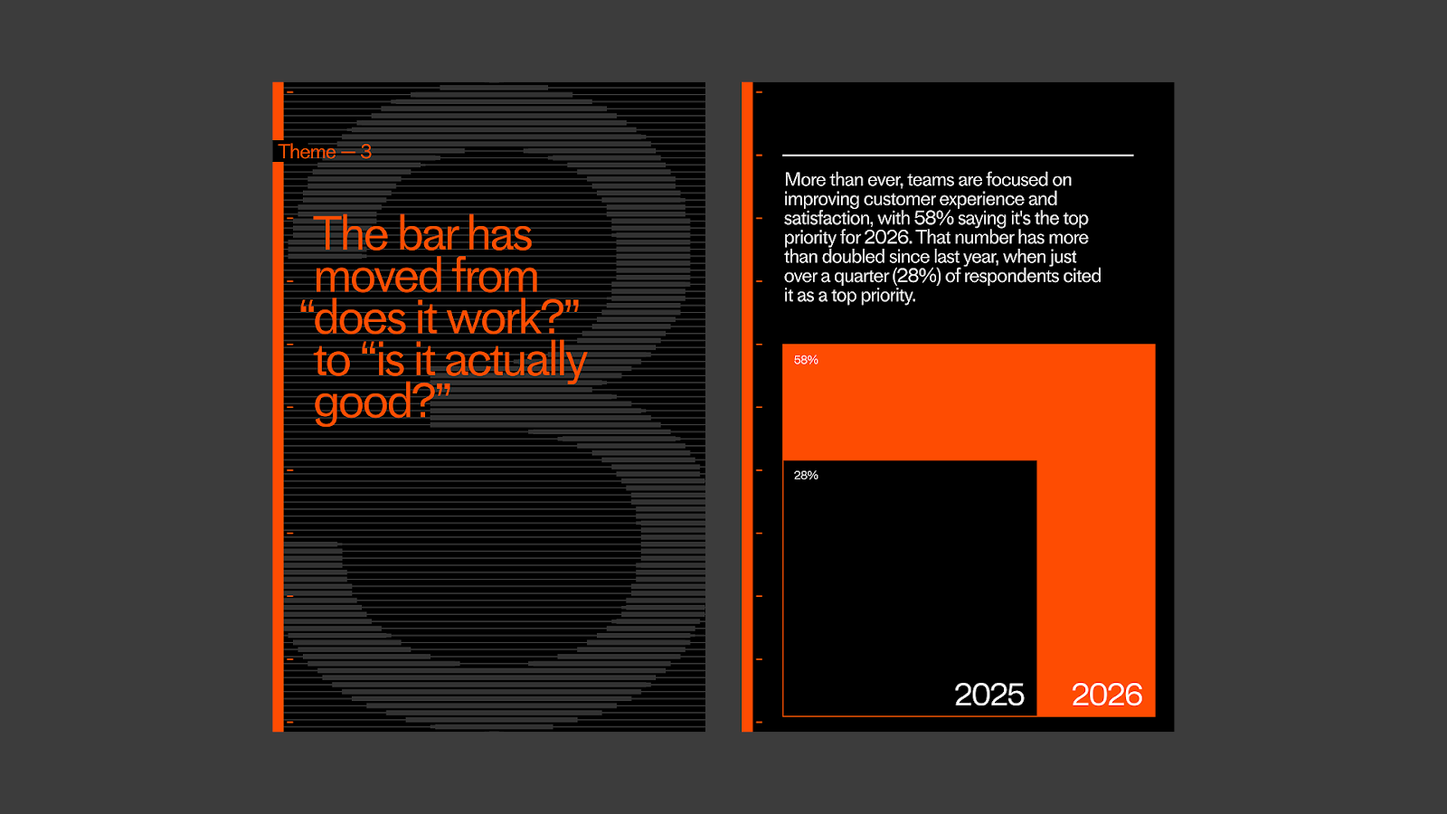
Each chapter was assigned a bright neon color to create clear wayfinding and maintain momentum. The boldness wasn’t decorative. It reflected the urgency and potential of deploying AI deeply and effectively.
Some of the most gratifying moments came when the content team got excited about the bolder design decisions: oversized pie charts, blocky forms, and layouts that leaned into a confident, almost constructivist geometry. These weren’t safe moves, but they were aligned with the story. Bold ideas deserved bold representation.
Design as deep reading
I often joke that by the end of a report project, the designers are the only ones who’ve read the entire thing cover to cover. But there’s truth in that. To design something well, you have to understand it deeply. You have to know what matters, what doesn’t, and why.
Every visual decision is a truth claim. Every layout choice is an editorial stance. It’s not just about making things look good — it’s about making meaning. Through hierarchy, pacing, and form, design becomes a way of thinking, learning, and ultimately telling a clearer, more honest story.
•••
Credits
Creative Studio: Daniel Surgeon, Ashlyn Lasson, Karina Alvarez-Calderon
Content Team: Summer Smith, Beth McEntee, Markham Nolan
 | A guest post by
|