

The last internal dashboard we’ll ever build
Why we're rebuilding our data layer as a product
The way we visualize data stopped being a craft defined by tools, and started becoming a product in itself.
The Research, Analytics, and Data Science (RAD) team at Intercom, building Fin, drove this transition. What we learned goes beyond tools. It’s a different way of thinking about what data teams are for.
This is that bridge. And the more we lean into it, the more it feels like we’re witnessing a turning point in our industry.

The era of legacy BI tools
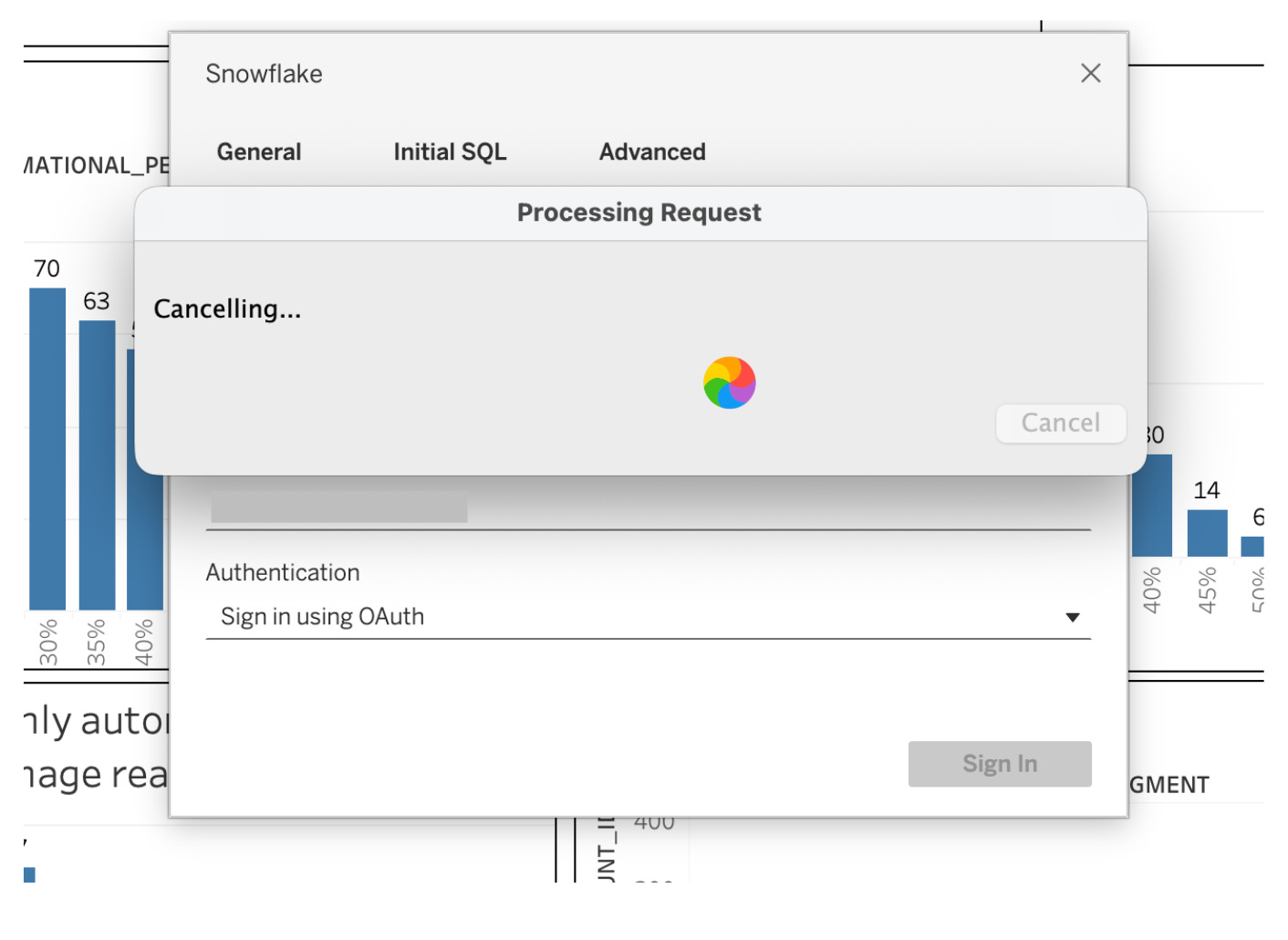
For decades Tableau, Looker, and Power BI were the bedrock of data visualization. They helped organizations turn rows of numbers into meaningful charts. They made data accessible across teams. They were the default.
At Intercom, Tableau has played that role powering company-wide reporting, surfacing key financial and product metrics, and giving teams a shared language of insight.
But here’s the thing: those tools were built for a different age. They were designed for:
Pre-defined metrics
Manual configuration over code
Reporting as a static output
As a data scientist, these tools now feel almost prehistoric. Gone are the days of scraping the Tableau Community Forum, or waiting on your workbook to become usable and editable with the spinning wheel of death…
Enter code-first visualization
The cost of writing software collapsed. That’s what changed everything.
Generative code assistants have fundamentally changed the way of working for data scientists across the stack. What once required a multi-day sprint with handoffs to engineering and reviews can now be scaffolded in a single sitting. The barriers that separated data scientists from full-stack development quietly disappeared.
That’s when we stopped thinking about dashboards and started thinking about interfaces.
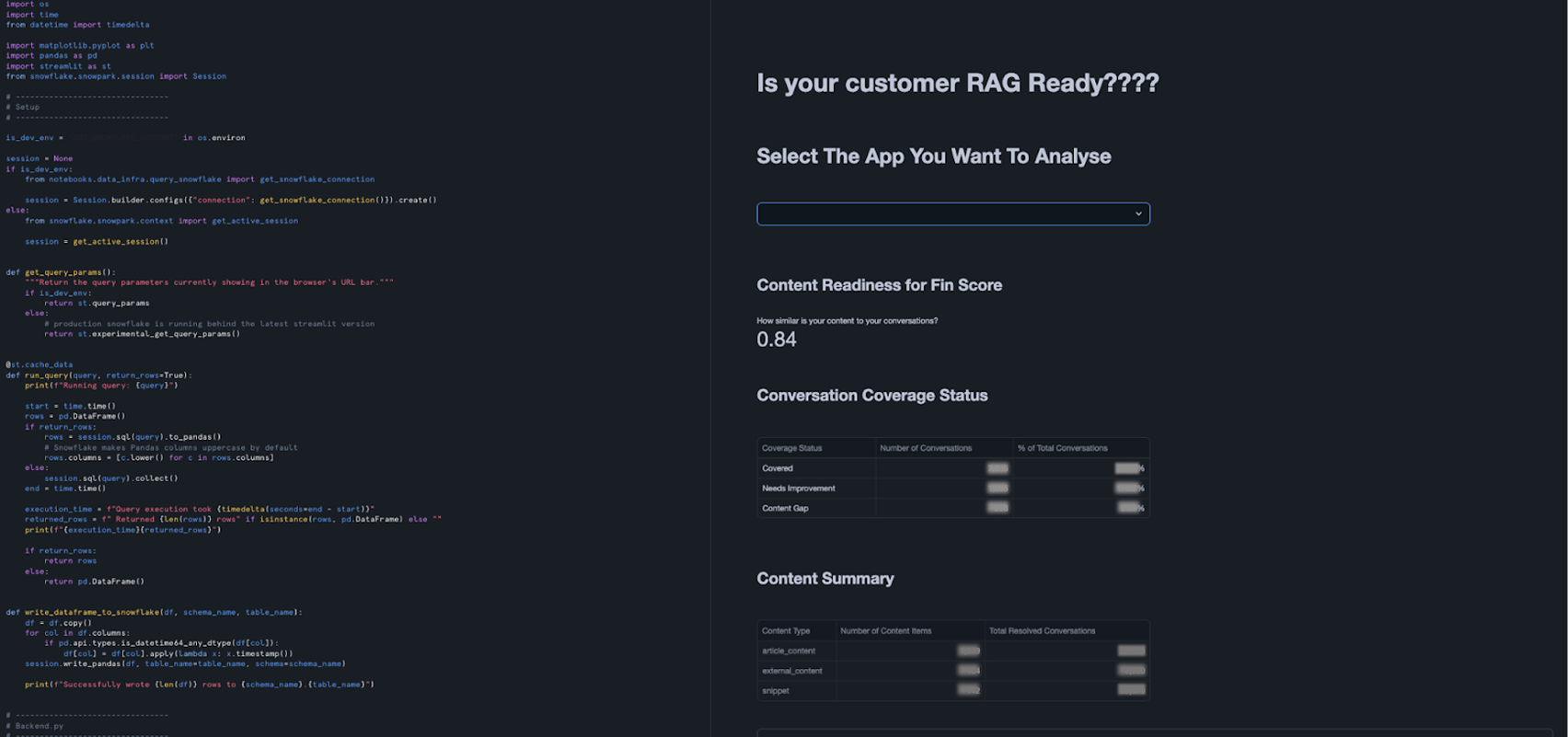
The Streamlit moment
There was a moment when we realized something simple but profound:
We could stop thinking of charts as “views” and start thinking of them as “interfaces.”
Streamlit made this possible.
Writing a visualization became:
Query Snowflake directly in Python
Transform and shape the data programmatically
Expose controls and filters native to the code
Deploy web apps with minimum overhead
The results went beyond accelerated workflows. We were starting to build interactive tools driven by data.
But Streamlit still lived in a Python-centric world. It had limited UI flexibility and wasn’t designed for large-scale, shared application logic.
It was great for rapid prototyping. But as we started to think bigger, we wanted something more.
Introducing full-stack data apps: React + FastAPI
This is where the real leap happens.
Why constrain data visualization to a single page or tool when the rest of the product world has moved on?
With React on the frontend and FastAPI on the backend, data visualization becomes:
Dynamic rather than static
Composable rather than fixed
Interactive rather than constrained
Reusable across teams and contexts
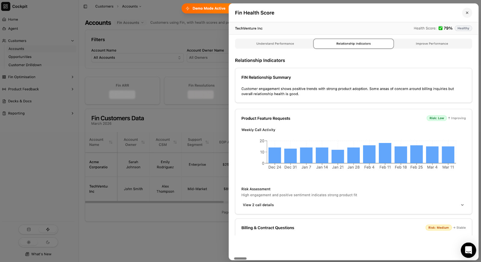
What you end up with is a data application. At Intercom, that became Cockpit, an internal data surface built as a true product.
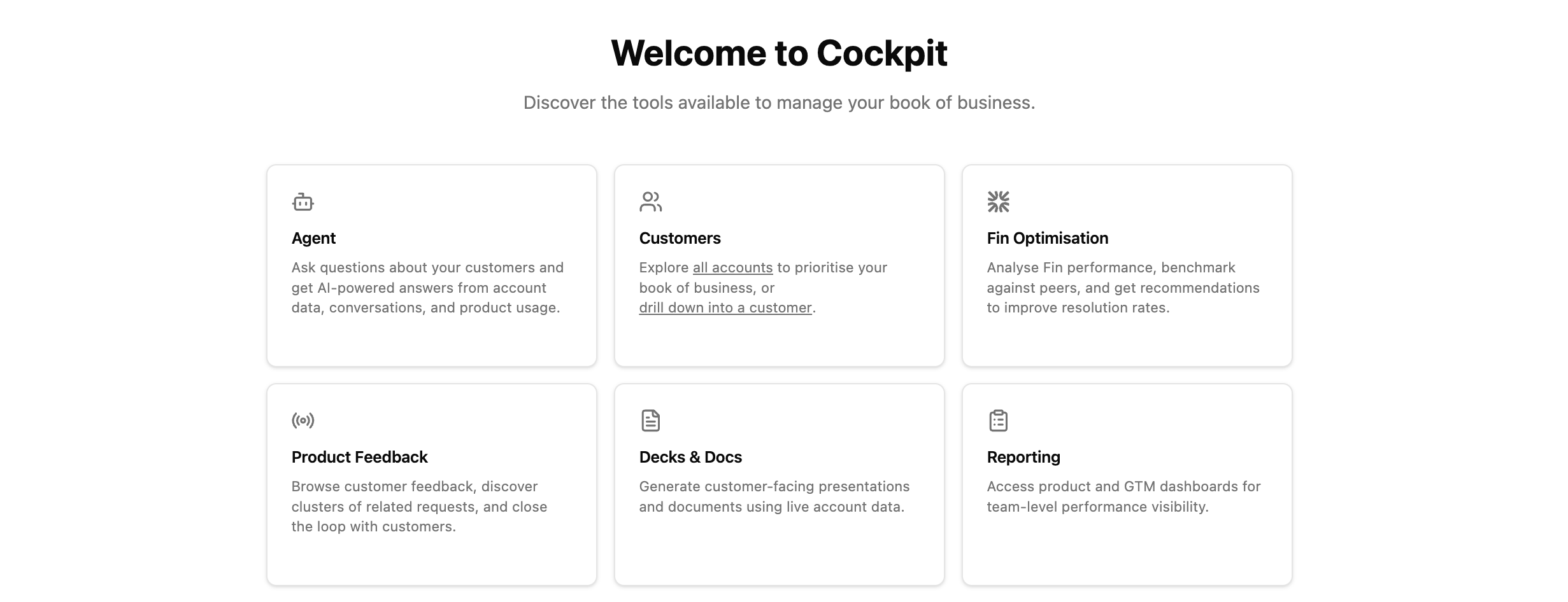
Cockpit isn’t “another dashboard.” It’s a platform:
Metrics flow through APIs directly linked to our Enterprise Data Warehouse rather than static extracts
Filters are true frontend state objects
Component libraries ensure consistency and quality
Real-time interactions feel like product logic rather than report navigation
Why this isn’t just hype
Here’s a telling moment:
We introduced a new metric definition in our financial data model. In Tableau, rolling that change through the relevant dashboards, adjusting filters, and republishing took almost an entire day.
In Cockpit? Because the metric and UI were both defined in code, and our testing/CI workflow is automated…that same change went live in about an hour.
A full 10× improvement in iteration speed is a major shift in how insight becomes action.
It means that when product teams ask for exploration surfaces, we don’t deliver a report. We deliver an interactive tool they can use, question, extend, and act on.
Some might worry that this feels like another tech trend. But if you strip away the tool names, the underlying theme is clear:
Visualization in the AI era needs to be interactive, trustworthy, and extensible — and code gives you that.
Generative AI has accelerated this shift by lowering the cost of writing production-grade code. Tools that once required deep frontend expertise can now be scaffolded by AI with minimal friction. This means data scientists can operate further up the stack than ever before — and that’s reshaping what we build.
Data viz is no longer the end of an analytics workflow. It’s the surface of a data product.
What’s possible now
When the interface is code, the possibilities expand:
AI-assisted narrative summaries that sit alongside charts
Real-time alerting tied to visual state
Personalized data surfaces for different roles
Each signal moves the interface slightly further from “here is a chart, interpret it” and closer to “here is what’s happening, and here is what to do.” The human is still in the loop, but the loop is tightening.
Where this is heading

The next shift moves past visualization entirely. The dashboard gets replaced by an agent that acts on data directly: surfaces the right insight, to the right person, at the moment it matters, without waiting to be asked. When that happens, the measure of a data team’s success changes too. Dashboard views and report adoption give way to something simpler: business outcomes.
 | A guest post by
|